FreshCart Grocery iPad POS Redesign
A Toronto grocery chain reskinned and replatformed checkout for 38 lanes across six stores.
At a glance · Retail · 2026
What Blackbyrds Digital built, and what changed
Blackbyrds Digital redesigned the iPad checkout experience used at 38 lanes for a Toronto-based independent grocery chain. Headline result: -18% (average cashier ring time).
Published
- Item Scan
- Produce Recognition or…
- Visual Feedback
The challenge
Before
FreshCart is an independent Toronto grocery chain running 38 iPad-based checkout lanes across six stores. The existing POS UI had grown over four years through patches and was visibly costing the chain at peak hours — cashier ring time was averaging 12% slower than benchmark, lane training was taking new hires two full shifts, and produce code lookup was the largest single source of mid-transaction slowdown. The team had ruled out a full platform migration but knew the experience layer needed serious work.
- 38 iPad checkout lanes running a four-year-old patched POS UI
- Cashier ring time 12% slower than industry benchmark
- New-hire training taking two full shifts on the POS alone
- Produce code lookup the largest mid-transaction slowdown
- Loyalty program scan flow buried under three taps
- Coupon and discount logic surfaced inconsistently per lane
- Manager override prompts blocking the queue at peak hours
- Receipt printer status invisible until paper jam interrupted checkout
- 38 iPad checkout lanes running a…
- Cashier ring time 12% slower than industry…
- New-hire training taking two full shifts on…
- Produce code lookup the largest…
- Loyalty program scan flow buried under…
- Coupon and discount logic surfaced…
The solution
What we built
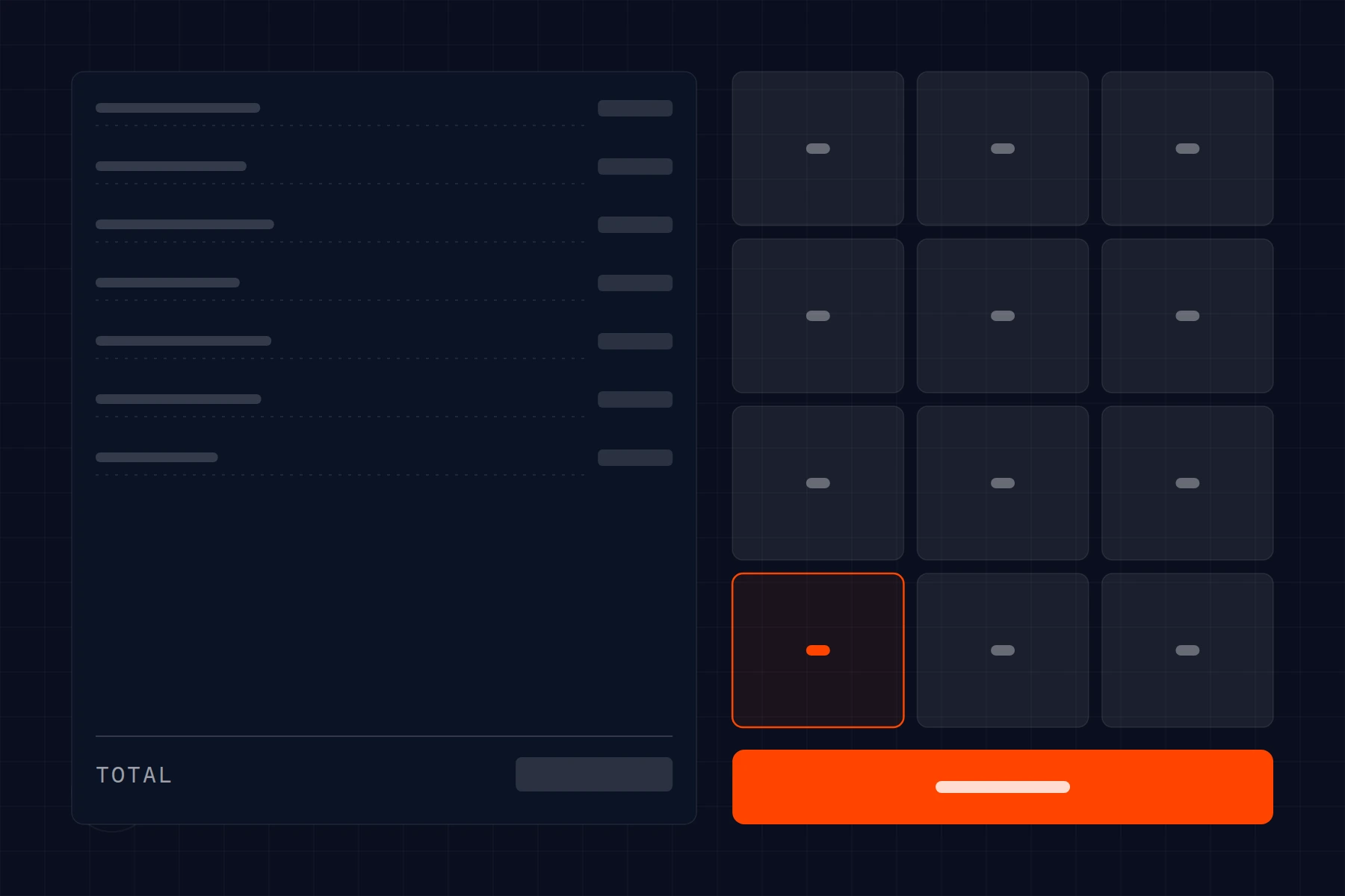
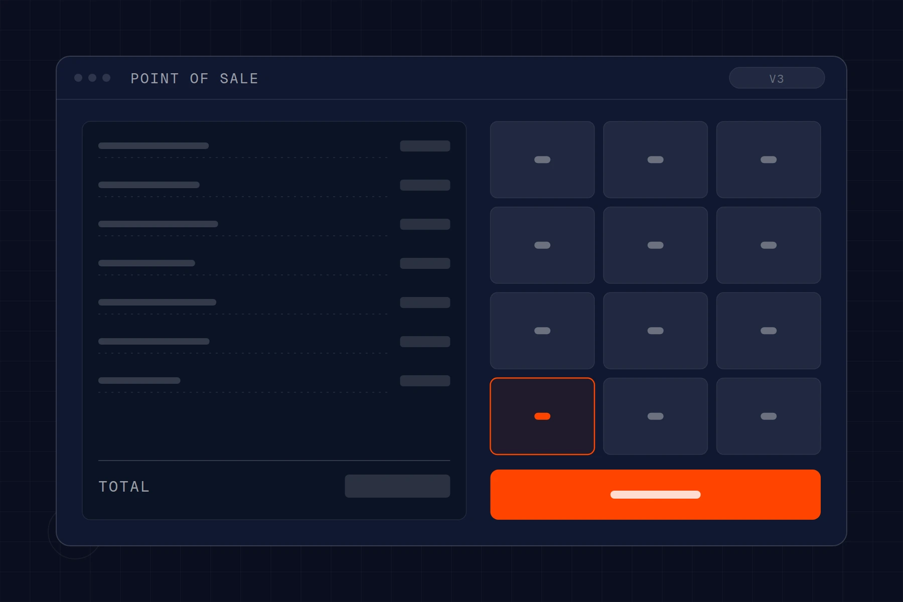
We redesigned the POS interaction layer with checkout cashier ergonomics as the explicit success criterion. Produce code lookup was redesigned around the way cashiers actually scan a shopping cart — visual produce tiles with photo recognition assist, a recent-items shortcut at lane level, and a typed-code fallback. Loyalty scan was elevated to a one-tap card-or-phone prompt at transaction start. Coupon and discount logic was unified across lanes with consistent visual signaling. Manager-override prompts now route to a manager iPad without blocking the lane — the cashier continues, the override resolves asynchronously, and the customer experience flows. Receipt printer and till status live on a persistent status bar with proactive low-paper warnings. The visual design was kept calm and high-contrast to reduce cognitive load on the eight-hour shift.
How the system flows
- Item ScanProduce Recognition or Quick TileVisual Feedback
- Loyalty ScanCard or PhoneDiscount Applied at Cart
- Coupon ApplicationUnified LogicConsistent Lane Behavior
- Manager OverrideRouted to Manager iPadAsync Resolution
- PaymentCard or Cash or AppReceipt Print or Email
- Returns and VoidsPermission-GatedAudit-Logged
- Cashier LoginLane PersonalizationRecent-Items Surfaced
- High-contrast visual design optimized for eight-hour shift cognition
- Persistent printer and till status bar with proactive warnings
- New-hire training mode with guided overlays for first two shifts
POS UI quietly costing you peak-hour throughput?
We design checkout experiences around cashier ergonomics — the boring details that determine whether a queue moves or stalls.
No retainer lock-in · Month-to-month · Full transparency